
Guidelines
for Designing a Useable Graphical Interface
An interface is the point of interaction or communication between the
computer application and the user. It is therefore vital to understand
the principles of interface and graphic design. Interface design is concerned
with how effectively users can interact or navigate with an application,
and graphic design focuses on the aesthetics and visual composition.
There are general guidelines for designing a graphical user interface
that apply to any interactive work whether it’s made to play on
a hard drive, CD-ROM, DVD-ROM, or on the web.
Create an intuitive navigation system
If your project is going to be used by a range of people with varying
computer literacy, making the navigation intuitive will allow it to be
understood easily and used effectively. If the interactivity is complex
and ambiguous, users will have difficulty accessing the information and
therefore will not get any value from it. Using graphical elements that
rae familiar to users make them easier to interact with. These can be
arrows buttons for forward or back. Clear and simple navigation support
interactivity.
If you find there is a need to write “Click the objects below to…”,
then you probably have a badly designed graphical interface. The need
to tell users directly that they have to click graphics is a sign that
you have not provided enough clues on how to navigate or the navigation
is not intuitive.
Make the function of a button/link clear
Buttons for navigation or media control should be clear and easy to use.
Generally images, which don’t look like they are linked, should
not be linked. It should be clear to the user what is a link or button
and what will happen if it is pressed.
Unless you are using commonly understood symbols, buttons should have
clear labels to identify their function. Buttons, which have unclear labels
or no labels at all, can be very confusing for the user.
Examples of what not to do:
Dalton Mailing Service.com
This site uses circular buttons that are unlabeled. While this site's
buttons do actually look like buttons, you have to move the cursor over
them and memorise each one in order to navigate through the site. This
does not allow for a user friendly navigation system.
Maintain consistency
Consistency should be maintained in the look of interface elements, their
placement on the screen and their behavior. Consistency will allow the
users of your application to readily identify interactive elements and
learn how to use them.
If a button behaves a certain way in one party of the application, there
should be consistently for all buttons of the same type. Buttons can be
similar rather than identical in appearance to form a relationship between
them and maintain consistency If buttons are of the same type (for example
buttons to control video), they should all respond in the same way when
the user interacts with them. When clicked, a button may move slightly
and invert giving the impression it has been clicked. If the user clicks
another button of the same type and this does not happen, he/she will
get confused.
Examples: Macromedia, Apple
Distinguish between different types of
interaction
You may have different ways a user can interact with your movie, such
as sending the user to a different location, entering information by typing
on the keyboard or dragging an object to another location (shown below).
By making the interactive element respond in a slightly different way,
the different types of interaction can become clearer and easier to understand.
Differences can be displayed in the way a button highlights, the cursor
that appears when moving over the object or sound that plays when clicked.
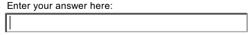

These interactive objects behave in different ways, the first is a common
button, the second asks for the user to enter text and the third allows
the user to drag the object. Each displays a different cursor and responds
differently when clicked. Using commonly used cursors allow the user to
immediately associate the action with the interactive element.
Provide feedback
Every user action should have some level of feedback to reassure the user
that their interactivity has been recognised. Feedback can be visual or
it can include audio. Feedback enhances navigation because it gives the
user acknowledgment of his/her actions. An example of feedback can be
changing the cursor when the mouse moves over a link or making a button
highlight when pressed.
Feedback should also be given for the current state of the application.
These include
Showing Progress: Some actions in your presentation may
take a long time to complete. If you are developing a shockwave movie,
a section may have to download before the user can continue and so force
the user to wait for a period of time. The user may mistake the delay
for an error and may think the application has stopped working. In this
case, by providing a progress bar to show how long the user has to wait
will help make the presentation more user friendly.
Providing Warnings: It is often useful to provide warnings
of an action that can cause destructive results. For example, you may
create a game, which allows the user to save his/her state. If the application
is closed before the game state is saved, the user will lose that information.
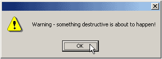
Warnings are also used to remind users when an application will exit.
It is important not to overuse warnings because they can be disruptive
to a movie. If you were given a warning before you left every section
of a presentation, they will become annoying as they will interfere with
your quick navigation.
Providing Help: Even in the most intuitive application,
the purpose of button/link or the way it works can be hard to figure out
for a new user. Providing help mechanisms can aid usability for more detailed,
or complex applications.
Anticipate user error
While you may design your interface and navigation to minimize errors
from the user, you should anticipate mistakes they could make. Example
of common errors include clicking the wrong button, accidentally double
clicking instead of single clicking or accidentally pressing a key (or
the wrong key if asked to do so). Anticipating mistakes may mean you have
to provide warnings as shown above.
Allow control of the presentation speed
The user should be able to control the speed at which he/she moves through
the information. This may include control of media such as scrollbars
for large amounts of text or play, pause, rewind buttons for video. During
animation it is useful to give users the option to skip it if they desire.
In a slide show section it is useful to have forward and back buttons,
even if the slide show can be viewed without interactivity.
If you have any feedback on this article, feel free to let us know at:
feedback@multimediacreative.com.au
©
2003 Multimedia Creative
